

Digital interfaces influence decisions long before a user clicks “buy”, “accept” or “subscribe”. Button size, default settings, countdown timers, price presentation and the number of steps required to reject an offer can all change behaviour.
Persuasion is a normal part of design, but dark patterns go further by making one choice easier while obscuring or discouraging another. Understanding the difference requires looking at how an interface affects the decision being made.
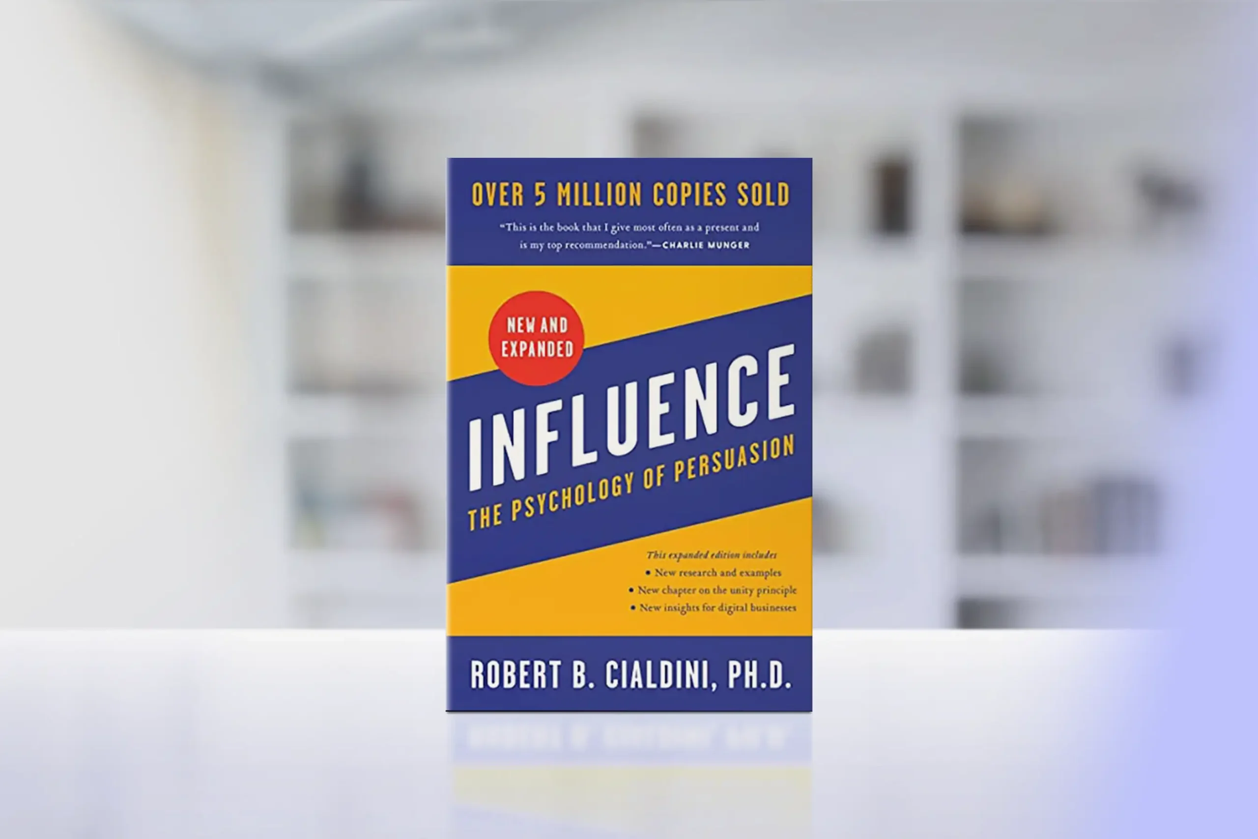
How Persuasion Principles Drive Digital Design?
Robert Cialdini’s principles of persuasion — including reciprocity, commitment, social proof, authority and scarcity — help explain why small interface choices can affect behaviour.
Their use is not automatically manipulative. Genuine customer reviews provide social proof, while a real deadline gives useful information about scarcity.
The problem begins when information does not reflect the underlying situation or when rejecting an offer requires substantially more effort than accepting it.
| Principle | Normal Use | Manipulative Application |
| Scarcity | Genuine limited availability | Countdown that resets after reaching zero |
| Social proof | Verified customer reviews | Fabricated reviews or inflated activity numbers |
| Commitment | Saving progress during checkout | Introducing charges only after several steps |
| Authority | Identifying a qualified expert | Misleading badges or unsupported endorsements |
| Defaults | Remembering a useful preference | Pre-selecting an option that benefits the business |
A good interface should keep key information visible rather than burying it behind extra steps, and a site such as nv casino shows how games, promotions and account functions can be organised into clear sections without hiding important details.
A design is less likely to be deceptive when the price, conditions and alternatives remain clear before the user commits to a decision.
What Dark Patterns Look Like in Practice?
Dark patterns often work through small obstacles rather than obvious false statements. A user may technically be able to refuse an option, but the interface can make refusal less visible or require extra steps. Common patterns include:
- Hidden costs — compulsory or optional charges appear late in checkout.
- Fake urgency — a timer or availability warning creates pressure without reflecting a genuine deadline.
- Forced continuity — a trial changes into a paid subscription without sufficiently clear renewal information.
- Roach motel — registration takes seconds, while cancellation requires several screens or another communication channel.
- False hierarchy — the preferred button is visually dominant while the alternative is difficult to locate.
- Confirmshaming — rejecting an offer requires clicking wording designed to make the user feel careless or unreasonable.
What matters is whether both choices are presented with comparable clarity and whether important conditions appear before commitment.
Hidden Costs and Price Presentation
Price manipulation often relies on timing. Suppose a product is advertised at €40. After the user enters personal details and reaches the final screen, a mandatory €6 charge appears. The total price is visible before payment, but the user has already completed most of the process.
Compare the advertised starting price with the amount shown immediately before payment and the final amount charged. Optional extras should also be reviewed individually instead of assuming the default selection is the cheapest or most suitable choice.
Subscription and Cancellation Friction
The same problem appears in subscription flows. A service might offer a one-month trial with a prominent “Start Free” button while placing the renewal price below the main call to action. The issue becomes clearer if cancelling later requires considerably more effort than joining.
Before subscribing, check when the first payment occurs, how much it will be, whether renewal is automatic and where cancellation is located.
In Ireland, keeping screenshots, confirmation emails and cancellation records can also be useful if a dispute develops.
Why Dark Patterns Work?
These designs exploit predictable behaviour rather than exceptional carelessness. Loss aversion makes a warning such as “Your discount will disappear” more persuasive than a neutral statement about price.
The default effect encourages users to leave pre-selected settings unchanged. Commitment makes abandoning a long checkout process harder after time has already been invested.
Dark patterns often combine several effects. A checkout can display a countdown timer, pre-select an extra service and place the decline option in smaller text. Together, these elements can significantly change the decision environment.
How to Check an Interface Before Committing?
Users do not need specialist knowledge to identify most manipulative designs. A short review before payment, registration or subscription is usually enough:
- Check whether urgency claims remain true after refreshing or returning later.
- Compare prominent text with footnotes, renewal terms and final prices.
- Look for pre-selected options before continuing.
- Find the cancellation process before starting a recurring subscription.
- Take a screenshot when an important price, promise or condition is displayed.
These checks matter most when money, personal data or an ongoing commitment is involved. The aim is to slow down when an interface appears designed to discourage comparison or reconsideration.
When Design Becomes a Consumer Protection Issue?
Dark patterns are increasingly treated as more than poor user experience. European rules restrict deceptive interface practices, while Irish authorities such as the Competition and Consumer Protection Commission examine digital practices that may unfairly influence consumers.
The distinction depends on what the interface actually does. Good persuasive design can recommend, highlight and simplify.
Manipulative design hides relevant information, creates false pressure or makes the commercially less valuable choice unnecessarily difficult. Recognising those signals helps users decide when to continue, compare alternatives or leave the process.
